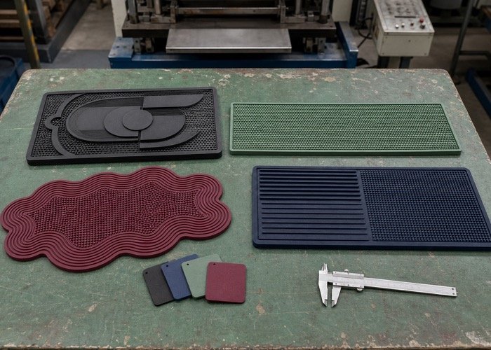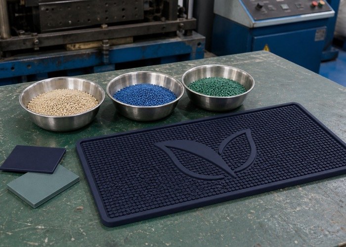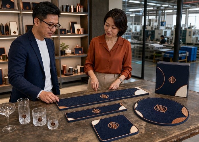

Investire in tappetini da bar personalizzati è una mossa brillante per elevare la presenza del tuo marchio, ma un logo mal progettato o posizionato male può sembrare poco professionale. Questa situazione spesso porta a uno spreco di budget per il marketing e, cosa ancora più importante, un impatto diluito del marchio proprio nel punto vendita. Fortunatamente, seguendo alcuni principi fondamentali di progettazione, you can ensure your logo looks sharp, professionale, and impossible to ignore.
For the best logo placement on custom bar mats, your logo should occupy about one-third of the surface area, positioned either centrally or in the lower half. Use a 3D embossed effect with high-contrast colors. Simplify complex graphics, use bold fonts, and ensure ample empty space around the design for maximum impact.
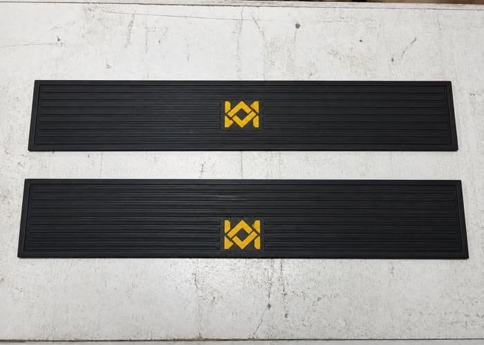
That provides the essential formula for success. To truly empower your next project, however, we need to explore why each of these rules exists. Understanding the logic behind great mat design will help you collaborate with your manufacturer to create a truly effective branding tool.
How Big Should Your Logo Be on a Custom Bar Mat?
Deciding on the perfect logo size can feel like a balancing act. A logo that is too small gets lost in the action of a busy bar, while one that is too large can overwhelm the mat and look cheap. The goal is to find that "just right" scale.
For most standard bar runners, the ideal logo size occupies approximately one-third of the total mat surface. This ensures it's large enough to be seen from a distance but leaves plenty of functional space for drinks and tools.
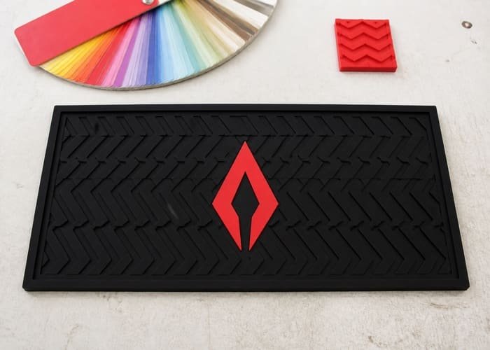
Immergiti più a fondo: The Rule of Thirds in Mat Design
The "rule of thirds" is a classic design principle that helps create balance and visual interest. While it's often used in photography, its application to custom bar mats is incredibly practical.
- Maximum Visibility: A logo that fills about a third of the mat is substantial enough to be easily read by both patrons sitting at the bar and staff working behind it. It’s a confident statement, not a timid whisper.
- Preserved Functionality: Remember, a bar mat is a tool. Bartenders will be placing glasses, shakers, and bottles on it. Leaving two-thirds of the mat as functional, open space means your logo is less likely to be constantly covered.
- Aesthetic Balance: This proportion prevents the design from looking either cramped or empty. It creates a focal point without turning the entire product into a single, flat advertisement.
Sizing Pitfalls to Avoid
It is essential to steer clear of the two extremes.
- The "Mini-Logo": A very small logo, perhaps tucked into a corner, completely defeats the purpose of a branded mat. It lacks confidence and will be invisible in a dimly lit, active bar environment. In my experience, clients who try to be too subtle with sizing are almost always disappointed with the final product's impact.
- The "Full-Bleed" Logo: Conversely, a logo that stretches from edge to edge looks less like a premium product and more like a cheap, printed flyer. It removes all sense of sophistication and can become distorted when objects are placed on it.
To visualize this, consider a standard bar mat of 60cm x 10cm (approx. 24" x 4"). The total surface is 600 cm². Your logo's footprint should be around 200 cm², which might translate to a design that is 20cm long and 10cm high. As your manufacturer, we can provide a free design sketch to show you exactly how your logo will scale on your chosen mat dimensions.
Where is the Best Position for a Logo on a Bar Mat?
Once you have the right size, determining its position is the next critical step. Placing a logo thoughtlessly can lead to it being constantly obscured or creating a visually awkward layout. Your logo's location should be intentional and strategic.
The two most effective positions for a logo on a custom bar mat are perfectly centered or placed in the lower half of the mat. Both options preserve the logo's visibility while respecting the mat's daily function.
Immergiti più a fondo: Center Stage vs. Strategic Lower Placement
Choosing between a central or lower-half position depends on your logo's shape and your priorities.
H3: The Classic Center-Stage Position
Placing your logo directly in the middle is the most traditional and often most impactful choice.
- Symmetry and Focus: A centered logo creates a sense of balance and immediately draws the eye. It is the undeniable focal point of the mat.
- Great for Bold Logos: This position works exceptionally well for compact, symmetrical, or circular logos. It gives them a commanding presence. The primary drawback is that the center is also a high-traffic area for drink preparation. Tuttavia, for a powerful branding statement, it's hard to beat.
H3: The Practical Lower-Half Position
Positioning the logo in the bottom half (or bottom third) of the mat is an incredibly smart, practical alternative.
- Reduced Obstruction: The top half of the bar mat is typically the "action zone" where bartenders slide glasses and mix drinks. Placing the logo lower means it remains visible and unobstructed for more of the time.
- Works with Rectangular Logos: This position is perfect for wide, rectangular logos or logos that include a tagline underneath the main graphic. It anchors the bottom of the mat cleanly.
H3: What to Avoid: The "No-Go Zones"
Almost as important as where to place the logo is where not to place it. Avoid pushing your logo right up against the edges or into the corners. Leaving a "safe margin" or "breathing room" around your entire design is crucial. This prevents the design from looking cramped and eliminates any risk of critical logo elements being trimmed during production. A healthy border makes the entire product look more deliberate and professional.
| Logo Position | Pros | Cons | Best For |
|---|---|---|---|
| Centered | High impact, symmetrical, balanced | Can be frequently covered by drinks/tools | Bold, simple, or circular brand marks |
| Lower Half | Stays visible, practical for bartenders | Less symmetrical, can feel bottom-heavy | Logos with taglines, rectangular designs |
| Corners/Edges | None | Looks cramped, unprofessional, risk of cutoff | Not recommended for primary logos |
Which Design Techniques Make Logos Stand Out on Custom Bar Mats?
Your logo's design can look fantastic on a screen but fall flat on a physical product if the wrong production technique is used. For materials like PVC and silicone, leveraging the manufacturing process itself is key to creating a stunning final product.
To make your logo truly pop, you should combine a 3D embossed effect with a high-contrast color palette. This pairing creates both a visual and tactile experience that a simple 2D print cannot match.
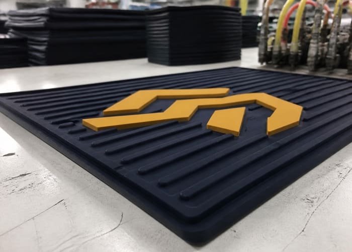
Immergiti più a fondo: The Power of Texture and Contrast
This is where working with an experienced OEM manufacturer like SuperfectCraft really pays off. We understand how to manipulate the material to serve your design.
H3: The Premium Feel of 3D Embossing
Unlike a flat print, an embossed (or debossed) logo is physically raised from (or recessed into) the surface of the mat. This is achieved by creating a custom mold for your design.
- Tactile Quality: The raised texture is instantly noticeable to the touch. It feels substantial and high-quality, which reflects positively on your brand. I've seen customers run their fingers over a new 3D mat; it's an instinctive reaction to good craftsmanship.
- Light and Shadow: The raised edges catch the light, creating natural shadows that enhance the logo's definition, especially in the varied lighting of a bar or salon.
- Functionality: The channels created by the 3D design are excellent for trapping spills, which is the primary job of a bar mat.
H3: Contrast is King for Readability
A 3D effect is only as good as its visibility. This is where color choice becomes paramount. The single most common mistake I see is choosing colors that are too similar. A dark gray logo on a black mat will be completely invisible from more than a foot away.
- Think Light vs. Dark: The goal is strong tonal contrast. Pair light colors with dark backgrounds, and vice-versa.
- Classic Examples: White on black, yellow on navy blue, red on a white background.
- Avoid: Navy on black, forest green on dark gray, orange on red.
- Bar Environments are Dark: Always remember the context. Your mat will be used in a dimly lit environment. Strong contrast ensures your brand name is readable even from across the bar.
Our production process involves precise color matching to your brand's Pantone values, followed by a careful dispensing and molding process to ensure the 3D effect and colors are perfectly rendered.
How Should You Adapt Your Brand Logo for a PVC Mat?
Many brand logos are designed for digital screens or print, featuring intricate details, gradients, and fine lines. These complex elements do not translate well to the physical molding process of PVC or silicone custom bar mats.
To successfully adapt your logo, you must simplify it. This means using bolder, thicker lines, choosing blocky or sans-serif fonts, and limiting the color palette, ideally to one or two colors plus the base mat color.

Immergiti più a fondo: From Complex to Clear
This simplification process isn't about "dumbing down" your brand; it's about optimizing it for the medium. Think of it like creating an app icon—it needs to be a clear, recognizable version of your full logo.
H3: Modifying Lines and Shapes
The manufacturing process involves injecting liquid PVC into a mold. This liquid has a certain viscosity and can't flow into microscopic channels.
- Thicken Thin Lines: Any lines in your logo should be made substantially thicker to create a viable channel in the mold.
- Eliminate Fine Details: Small, intricate details (like the feathers on a wing or tiny decorative flourishes) will likely merge or appear muddy. It's better to represent these with a cleaner, more stylized shape. For example, a detailed illustration of a lion would be simplified to a bold, iconic lion head silhouette.
- Remove Gradients: Color gradients are impossible to achieve with the PVC dispensing process. These must be converted to solid blocks of color.
H3: Choosing Mat-Friendly Typography
Text is often the most challenging part.
- Go Bold: Choose a bold or black version of your brand font.
- Favor Sans-Serif: Fonts without serifs (the little feet on letters, like in Times New Roman) generally reproduce more cleanly. The serifs can be too thin to mold properly. Fonts like Helvetica, Arial, and Futura are excellent choices.
- Increase Kerning: Slightly increasing the space between letters (kerning) can prevent them from blending together during production.
A SuperfectCraft, our 24-hour design sketch service is perfect for this. We can take your complex logo and show you a proposed simplified version, ensuring you approve the new look before we even think about making a sample.
Domande frequenti
What is the best file format to provide for my logo?
For the best results, please provide your logo in a vector format, such as .AI (Adobe Illustrator), .EPS, o .PDF. Vector files allow us to scale your logo to any size without losing quality and make the necessary simplifications for the molding process.
Can you produce custom bar mats with complex, multi-color logos?
While we can produce mats with multiple colors, we recommend limiting the design to 1-2 colors on top of the base mat color for the best results. Each additional color adds a step to the production process and can make the design look cluttered. Our 3D embossed technique works best with clean, high-contrast color schemes.
What is your minimum order quantity (MOQ) per tappetini bar personalizzati?
Il nostro MOQ standard è 200 pieces per design, per colore, especially when using one of our many existing molds for the mat's shape and size. This allows for efficient mass production and provides the best value for our B2B clients.
How long does it take to get a sample and start mass production?
After you approve the design sketch, producing a physical sample typically takes about 7 giorni. Once you approve the sample, mass production lead time is generally between 20 E 30 giorni, depending on the complexity and quantity of your order.
Conclusione
Designing an effective logo for a bar mat is a science. By adhering to these five foundational pillars—Misurare (1/3 of the mat), Position (centered or lower half), Technique (3D embossed with high contrast), Simplification (bold lines and fonts), E Spacing (leaving a clean border)—you can guarantee a professional outcome. Applying these principles will transform your custom bar mats from simple, functional items into powerful and sophisticated branding assets that capture attention and reinforce your brand identity where it matters most.
Ready to see how your logo would look on a premium mat? Contact us at SuperfectCraft for a free, no-obligation design sketch within 24 ore. Let's create something exceptional together.
- Whatsapp: +86 15816822766
- E-mail: sales01@superfectcraft.com
- Sito web: www.superfectcraft.com
- Contact Form: https://babarmat.com/contact/