
Choosing the perfect color ideas for custom bar mats is a critical decision that directly impacts your brand's perception. A generic mat can make your bar look forgettable, and the wrong colors can clash with your decor or cheapen your brand identity. The right color scheme, Jedoch, transforms a simple accessory into a powerful statement piece that captures attention and reinforces your style.
The best color ideas for custom bar mats align with your brand's identity and environment. Key concepts include vintage palettes (caramel brown, deep green) for classic pubs, UV fluorescent colors (neon on black) for nightclubs, minimalist Morandi shades (dusty pink, slate blue) for modern cafes, and earthy tones (sand yellow, rock gray) for outdoor venues. The most effective designs prioritize high contrast and limit the color count to two or three for a clean, premium look.
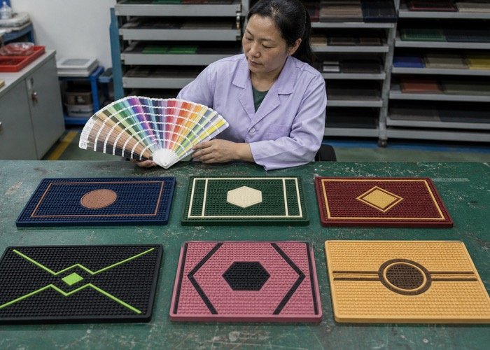
Deciding on a color scheme goes beyond simple aesthetics. It involves understanding color psychology, your target audience, and the specific lighting and decor of your space. Let’s explore some proven color concepts that will help your custom bar mat stand out for all the right reasons.
How Can Vintage Color Ideas for Custom Bar Mats Enhance a Classic Ambiance?
Your craft brewery, whiskey bar, or classic pub likely cultivates a distinct old-world charm. A modern, brightly colored mat would feel jarringly out of place within that carefully curated atmosphere. By embracing vintage color schemes, you can connect your bar mat directly to your brand's nostalgic and sophisticated identity.
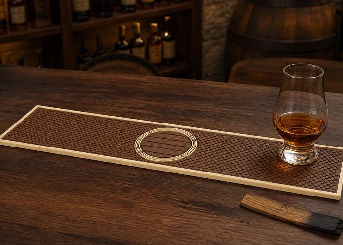
A vintage palette typically features rich, warm, and slightly desaturated colors. Think caramel browns, deep greens, maroons, and off-whites that mimic the look of aged paper, leather, and wood.
Dive Deeper: Crafting a Timeless Look
For brands that pride themselves on heritage, craftsmanship, and tradition, a vintage design is a perfect match. The goal is to evoke a sense of history and premium quality, making customers feel like they are part of a long-established story.
H3: For Craft Breweries & Bourbon Bars A popular and highly effective combination is a caramel brown or deep maroon base with a cream or beige logo. This palette is rich, warm, and inviting. It reminds customers of aged spirits, oak barrels, and leather-bound books. This color scheme works exceptionally well in venues with a lot of wood paneling, dim lighting, and brass accents. The brown base feels grounded and authentic, while the off-white logo provides excellent contrast without being stark. For a recent project with a bourbon brand, we used this exact combination; the client reported that customers frequently complimented the mats for "feeling as rich as the whiskey."
H3: For Old-Fashioned Pubs & Speakeasies Another classic approach is a dark, forest green base with an off-white or old-gold printed logo. This simulates the aesthetic of old European liquor labels and traditional pub signage. The deep green is sophisticated and timeless, suggesting heritage and quality. When paired with a slightly "aged" or distressed font in the design file, the effect is even more convincing. This look communicates that your establishment is a serious, authentic place for connoisseurs.
Consider these powerful vintage pairings:
- Caramel Brown & Eggshell White: Warm, rustic, and perfect for bourbon or craft beer.
- Forest Green & Old Gold: Classic, premium, and ideal for Irish pubs or high-end cocktail bars.
- Deep Burgundy & Ivory: Sophisticated and luxurious, suitable for wine bars.
- Navy Blue & Antique Silver: A nautical or stately alternative that feels both classic and strong.
When Are UV Fluorescent Color Ideas for Custom Bar Mats Most Effective?
Your venue thrives in the dark, pulsating energy of a nightclub, concert hall, or trendy late-night bar. In these low-light environments, a standard bar mat can completely disappear, wasting a valuable branding opportunity. Utilizing UV fluorescent colors ensures your logo not only remains visible but becomes a captivating focal point.
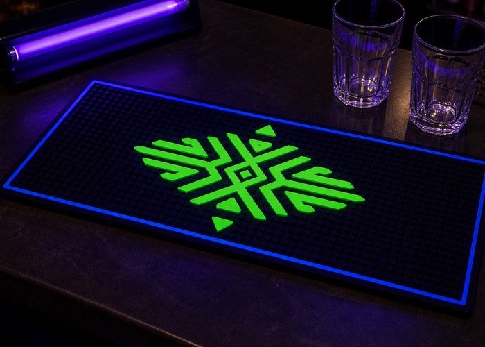
These colors are designed to react to ultraviolet (blacklight) fixtures. They are perfect for energy drink promotions, modern music venues, and trade show booths aiming to create a high-energy, unforgettable visual experience.
Dive Deeper: Glowing for Maximum Impact
UV fluorescent ink contains special pigments that absorb invisible UV light and re-emit it as visible, vibrant color. This creates a brilliant glowing effect that is impossible to ignore in a dark room.
H3: The Power of a Matte Black Base The most effective way to use UV ink is to pair it with a matte black background. The matte finish absorbs ambient light rather than reflecting it, which prevents glare and makes the fluorescent logo appear even brighter and more intense. This high-contrast combination creates a sharp, clean look that is both modern and mesmerizing. Popular UV colors that pop against black include:
- Neon Green: Evokes energy, technology, and futuristic vibes.
- Electric Orange: Suggests fun, excitement, and vibrancy.
- Hot Pink: Playful, bold, and impossible to miss.
- Cyber Blue: Cool, sleek, and high-tech.
H3: A Magnet for Social Media Beyond just looking cool, UV fluorescent mats are a powerful tool for organic marketing. The glowing effect is tailor-made for photos and short-form videos on platforms like Instagram and TikTok. Patrons love to capture the unique visuals, and when they post, your branded mat gets shared with their entire network. This turns a simple bar accessory into a viral marketing asset. Energy drink brands and youth-focused liquor companies have used this strategy with tremendous success.
Here is a quick comparison of standard versus UV inks:
| Besonderheit | Standard Ink | UV Fluorescent Ink |
|---|---|---|
| Best Environment | Well-lit cafes, pubs, Restaurants | Nightclubs, dark bars, concerts, events |
| Visual Effect | Static color | Glows brightly under blacklight |
| Brand Vibe | Versatile | Modern, energetic, edgy, youthful |
| Social Media Potential | Moderate | Very High |
As a manufacturer, we can precisely formulate these inks to create a stunning glowing effect that elevates your brand in any low-light setting.
Why Choose Minimalist Morandi Colors for Your Cafe or Modern Bar?
You have meticulously curated a clean, bright, and modern aesthetic for your high-end coffee shop, chic afternoon tea spot, or minimalist cocktail bar. In diesem Umfeld, a loud, cluttered bar mat would disrupt the serene and sophisticated atmosphere you have worked so hard to create. A minimalist approach using Morandi colors ensures your bar mat seamlessly complements your decor.
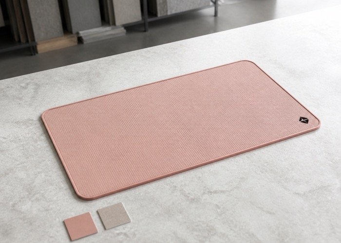
Named after the Italian painter Giorgio Morandi, these colors are muted, low-saturation tones. Think dusty pinks, sage greens, light grays, and milky coffee beiges. The design philosophy is "less is more," often featuring a single base color with a small, dark logo and generous empty space.
Dive Deeper: The Elegance of Understatement
Minimalism in design communicates confidence. It suggests that your brand is so strong it doesn't need to shout to be heard. This style is incredibly popular with brands that want to be perceived as premium, artisanal, and design-conscious.
H3: The Psychology of Muted Tones Morandi colors have a powerful psychological effect. Their low saturation is calming and easy on the eyes, creating a sense of tranquility and elegance. This is a stark contrast to the high-energy jolt of bright, saturated colors. Customers associate these muted palettes with sophistication, quality, and a modern sensibility. This is why you see them used so often by artisanal coffee roasters, upscale bakeries, and high-end cosmetic brands.
H3: Designing with Negative Space The hallmark of this style is the strategic use of negative space (the empty area of the mat). By placing a small, well-defined logo in a corner or off-center, the large, plain area actually draws more attention to it. The eye is naturally drawn to the single design element in an otherwise uncluttered field. This makes your brand mark feel deliberate and important.
Here are some excellent minimalist color combinations:
- Light Milky Coffee base with a Dark Brown Logo
- Dusty Rose / Pale Pink base with a Charcoal Gray Logo
- Light Slate Blue base with a Navy Logo
- Sage Green base with a Deep Forest Green Logo
This style is perfect for creating an "Instagrammable" moment that aligns with a clean, airy social media feed. It shows that every detail in your establishment, right down to the bar mat, has been thoughtfully considered.
What Are the Best Color Ideas for Custom Bar Mats Used Outdoors?
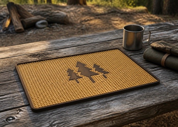
Your pop-up bar, beer garden, or campsite-themed venue operates in the great outdoors, facing sun, spills, and dirt. A standard indoor mat with delicate colors would quickly fade under UV exposure and show every speck of grime, looking worn out in no time. Opting for rugged, earth-toned color ideas for custom bar mats ensures your investment remains durable and attractive.
Practicality is key for outdoor use. We recommend earthy tones like sand yellow, rock gray, and deep brown. These colors are not only thematically appropriate but also offer superior performance against the elements.
Dive Deeper: Marrying Durability with Design
For outdoor applications, the color choice is both an aesthetic and a technical decision. You need a mat that looks good while standing up to harsh conditions.
H3: Practical Performance of Earth Tones From a material science perspective, darker and earthy pigments used in PVC and rubber are often more stable when exposed to sunlight. They contain more carbon or resilient compounds that help resist fading from UV radiation. Furthermore, these colors are exceptional at hiding dirt, dust, and minor stains. A splash of coffee on a beige mat is a disaster; on a dark brown mat, it's barely noticeable. This keeps your service area looking clean and professional, even during a busy day.
- Sand Yellow / Khaki: Perfect for beach bars or desert themes. Hides dust and sand well.
- Rock Gray / Charcoal: A neutral and modern choice that hides almost any stain and resists fading.
- Earth Brown / Terracotta: A warm, natural color that blends perfectly with wood and rustic decor.
H3: Aligning with the Outdoor Atmosphere Beyond their practical benefits, these colors just feel right for an outdoor setting. They connect your brand to the natural world, reinforcing a rugged, adventurous, or laid-back vibe. A "rock gray" mat feels at home at a mountain lodge bar, while a "sand yellow" mat is the perfect accessory for a pop-up on the beach. They complement natural materials like raw wood, stone, and metal, creating a cohesive and authentic environment. Bei SuperfectCraft, we can advise on both the color and the material (z.B., a more durable rubber vs. PVC) to ensure your outdoor mat performs as good as it looks.
What Common Color Mistakes Make a Custom Bar Mat Look Cheap?
You are investing in custom bar mats to elevate your brand presence. Jedoch, certain design choices can unfortunately backfire, resulting in a mat that looks tacky, unprofessionell, and cheap. By understanding and avoiding a few key pitfalls, you can ensure your final product looks premium and works effectively.
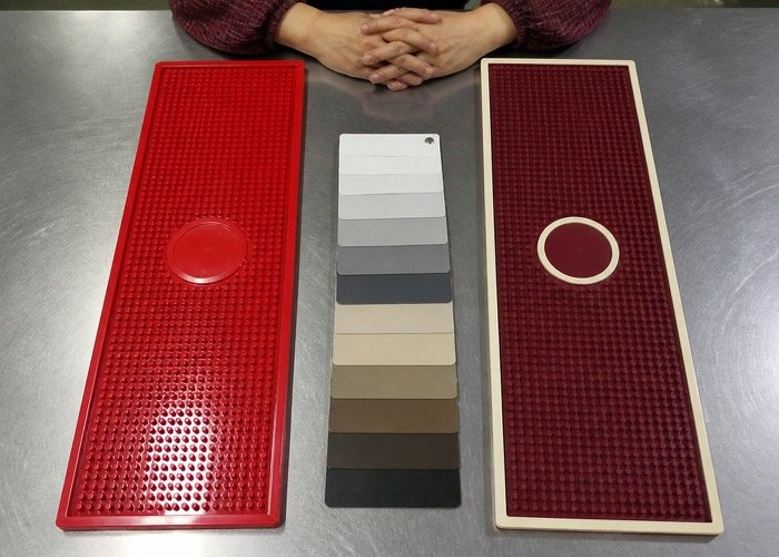
The most common mistakes are easily avoidable. They include using a glossy base, choosing oversaturated primary colors, cramming too many colors into one design, and failing to create enough contrast between the logo and the background.
Dive Deeper: How to Ensure a Premium Finish
A high-quality look comes from thoughtful, deliberate choices. Here’s what to steer clear of.
H3: The Problem with Glossy Finishes & Bright Colors A glossy or shiny surface on a bar mat is a major red flag. Under bar lighting, it creates harsh glare and reflections, making your logo difficult to read and giving the material a cheap, plastic look. Always opt for a matte finish. It absorbs light, reduces glare, and gives the PVC or rubber a more sophisticated, premium feel.
Similarly, avoid using large areas of high-saturation primary colors like bright fire-engine red or lemon yellow. These can look jarring and low-budget. Instead, choose a slightly desaturated version—for example, swap bright red for a deep maroon or bright yellow for a rich mustard or gold.
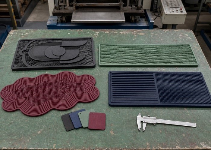
H3: The Rule of Three: Limit Your Color Palette While our multi-color dispensing process is highly advanced, a good design rarely needs more than two or three colors. Using too many colors makes the mat look cluttered and "busy." It distracts from your logo and can significantly increase production costs, as each color requires a separate, precise injection step. A simple two-color design (one for the base, one for the logo) is often the most powerful and elegant solution.
H3: Contrast is King for Readability This is the most critical rule. If your customers can't easily read your logo, the mat has failed. You must ensure there is sufficient contrast between your logo color and your background color.
- Bad Contrast: Light gray logo on a white background; navy blue logo on a black background.
- Good Contrast: White logo on a navy background; black logo on a beige background.
H3: Gold and Silver: Choose Matte Over Shiny If you want a metallic look, avoid bright, shiny gold or silver. It often looks like cheap glitter and lacks sophistication. Instead, request a matte gold, brushed gold, or antique silver effect. These finishes suggest the look of real metal without the gaudiness, conveying a sense of luxury and high value.
Häufig gestellte Fragen
How many colors can I use on a custom bar mat?
While our manufacturing process can accommodate multiple colors, we strongly recommend using a maximum of three for a clean, professional, and cost-effective design. In most cases, a two-color scheme—one for the base and one for the logo—provides the strongest visual impact and brand clarity.
Does the color affect the price of the custom bar mat?
Ja, the number of colors directly impacts the price. Our process involves dispensing each color individually. Every additional color adds a step to production, increasing labor time and complexity. Specialty inks, such as UV fluorescent pigments, may also have a slightly higher cost than standard colors.
Can you match my brand's exact Pantone colors?
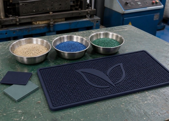
Absolut. Bei SuperfectCraft, we specialize in precise OEM/ODM production, which includes Pantone (PMS) color matching. During the pre-production sample phase, we will create physical color swatches of the PVC or rubber material for your approval, guaranteeing the final product is a perfect match for your brand guidelines.
What's the most durable color for a bar mat?
Generally, darker and earth-toned colors like black, charcoal gray, and deep brown offer the best long-term durability. These pigments tend to be more resistant to fading from UV light and are far better at concealing stains from spills and daily use, making them ideal for high-traffic bars or outdoor settings.
Abschluss
Finding the right color ideas for custom bar mats is a crucial exercise in balancing brand identity, your service environment, and pure visual impact. Whether you opt for a nostalgic vintage look, a glowing UV design for nightlife, a serene minimalist palette, or a rugged outdoor scheme, the goal is the same: to create an accessory that strengthens your brand. By following these concepts and avoiding common mistakes like poor contrast or cluttered designs, you can develop a bar mat that is both beautiful and functional. A well-designed mat is more than just a place to catch spills; it's a constant, subtle advertisement for your business.
Ready to bring your brand to life with the perfect custom bar mat? Our team at SuperfectCraft offers a free 24-hour design sketch service to help you visualize your ideas. Contact us today at sales01@superfectcraft.com or on WhatsApp at +86 15816822766 to get started!